JAVA BIKES BRAND DESIGN
JAVA, Asia’s leading bicycle manufacturer, entrusted us with the task of reinventing its image. The objective was clear: to create a single, coherent identity that encompasses every aspect of the brand, from products (from racing and gravel bikes to electric and city bikes and accessories) to stores and corporate communications.
SERVICES
Art direction
Video production
Visual Design
Photography
Full CGI
BRAND MANUAL
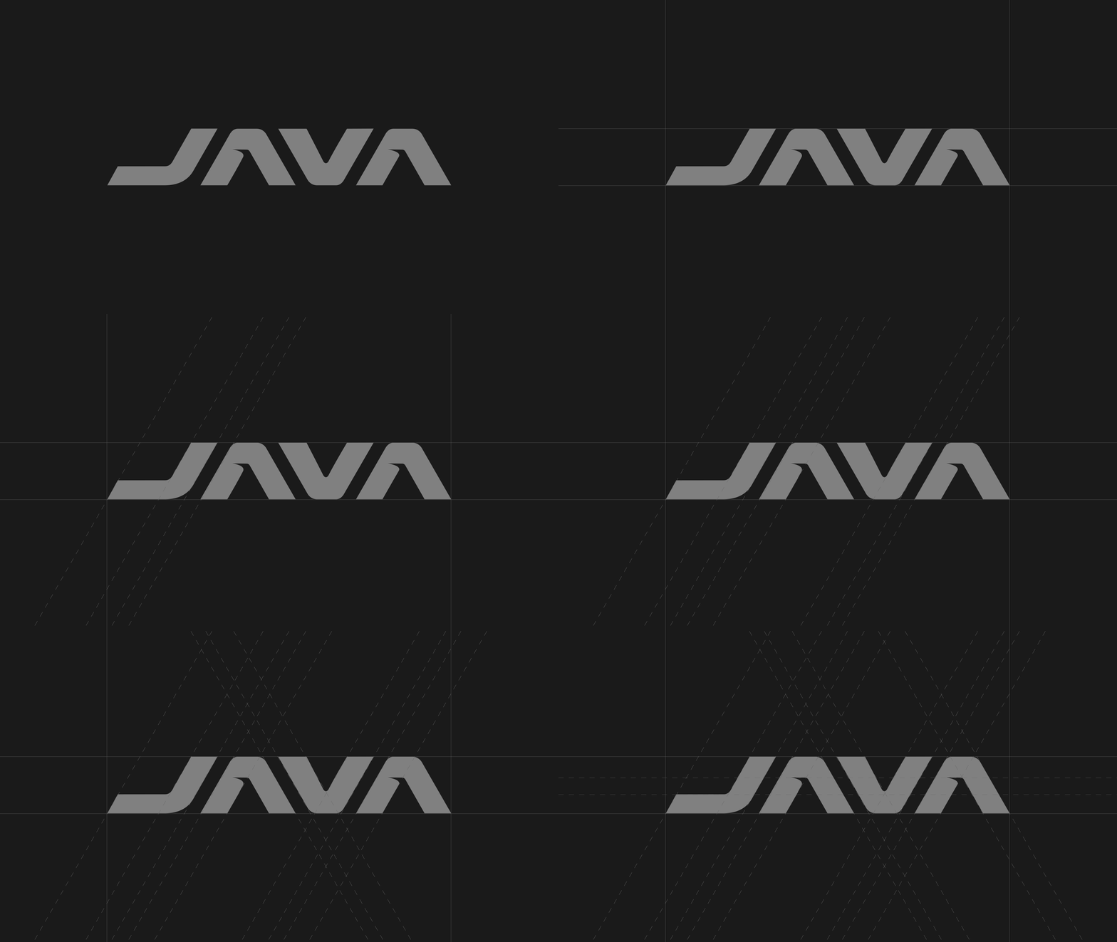
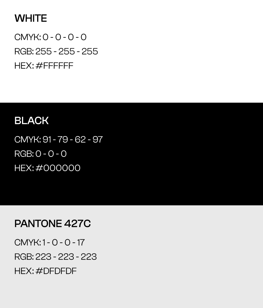
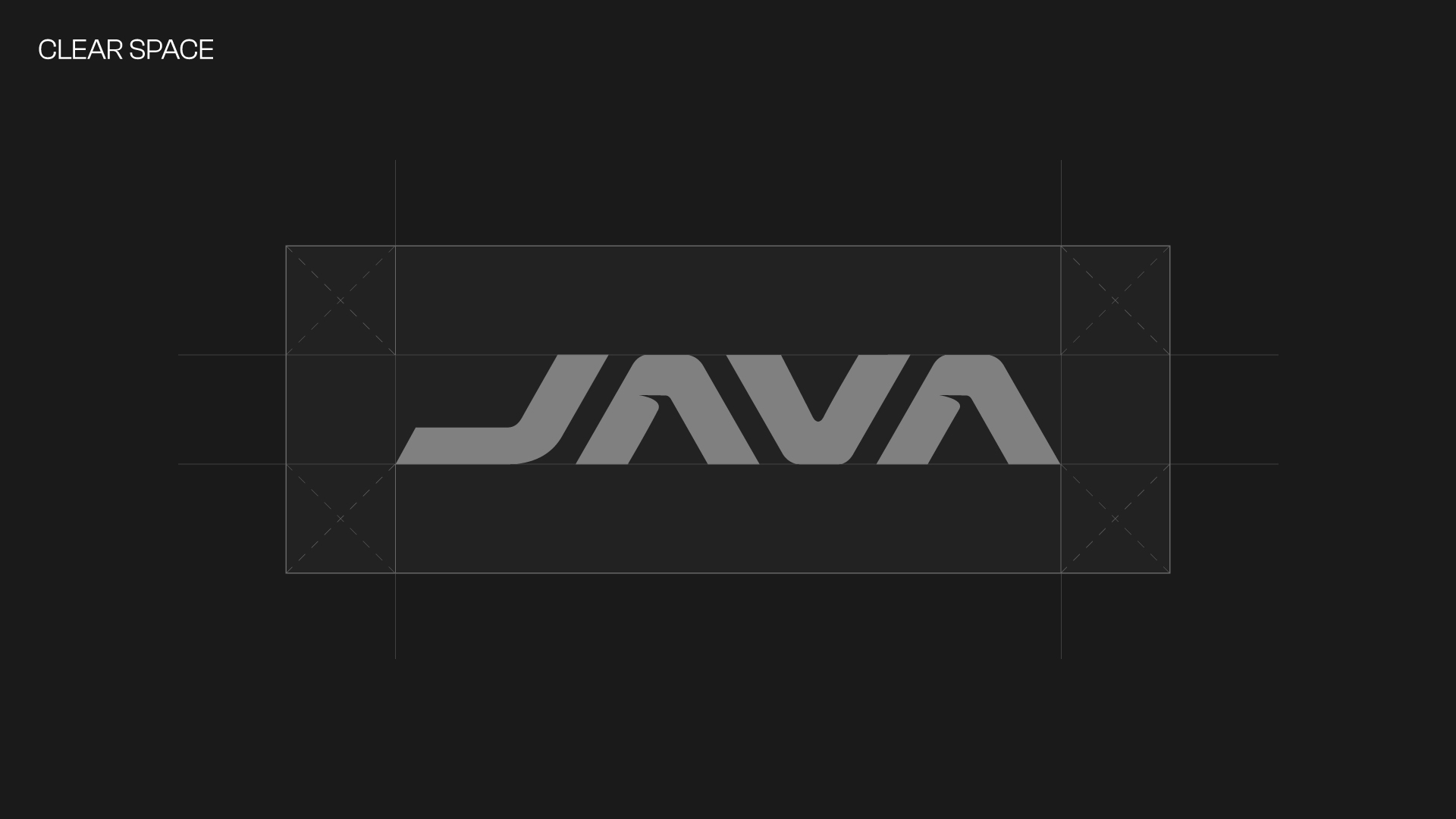
We began our journey with the creation of the Brand Manual, a fundamental document that guided our approach to brand definition. In this manual, we paid particular attention to the study of the logo, refining it through a precise geometric arrangement, determining the safety margins, establishing the institutional colours, selecting the ideal font and outlining the visual language. We also worked carefully on the layout of the communications, ensuring consistency and cohesion with the rest of the material. Naturally, we set strict guidelines for the positioning of the logo in the product design.
Our claim, ‘A new way to conceive the bike’, inspired our choice of a modern, minimalist style. From the colour selection to the typeface to the layout, every element was carefully designed to reflect this innovative philosophy.
Our claim, ‘A new way to conceive the bike’, inspired our choice of a modern, minimalist style. From the colour selection to the typeface to the layout, every element was carefully designed to reflect this innovative philosophy.
LAYOUT DESIGN
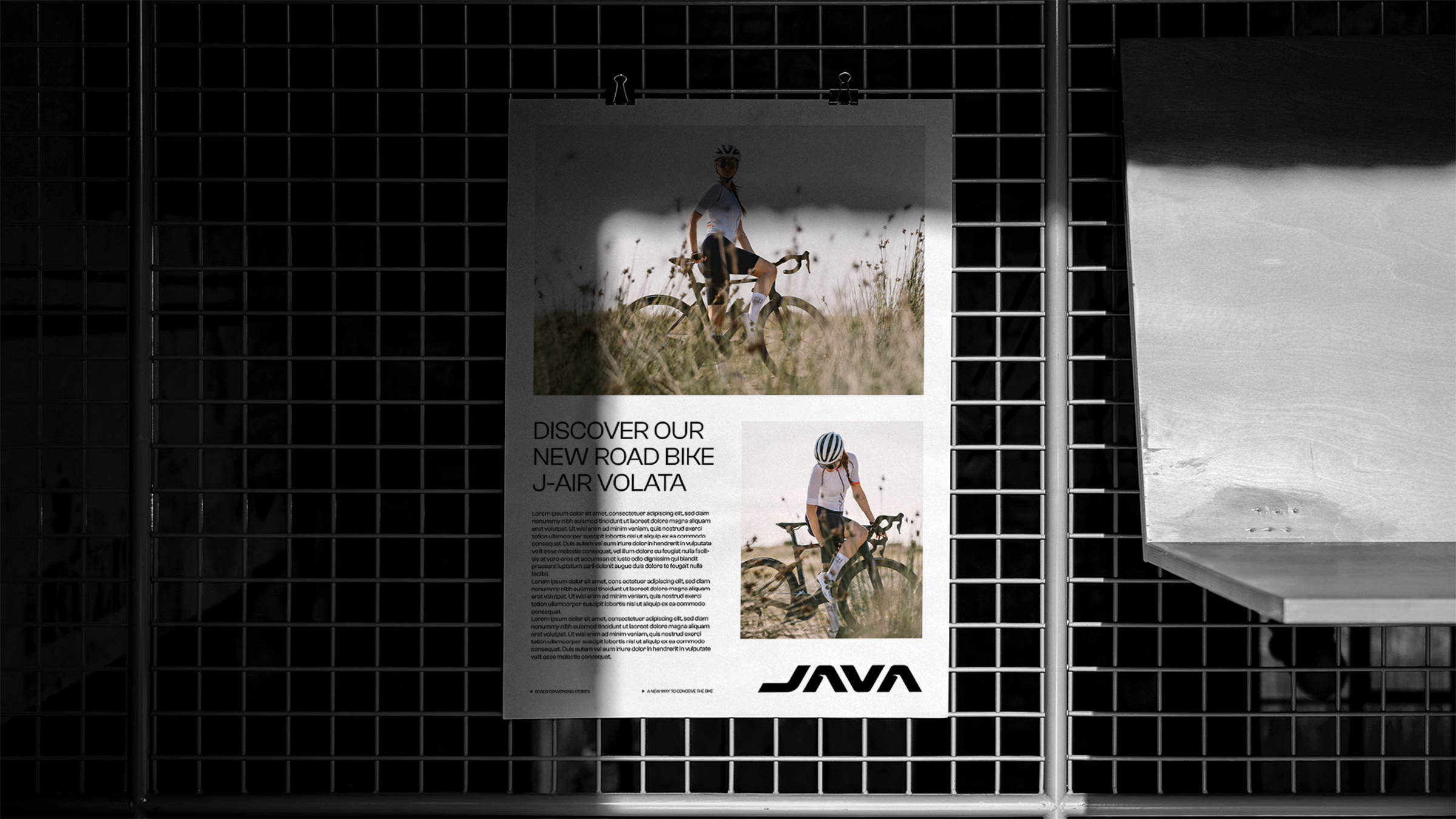
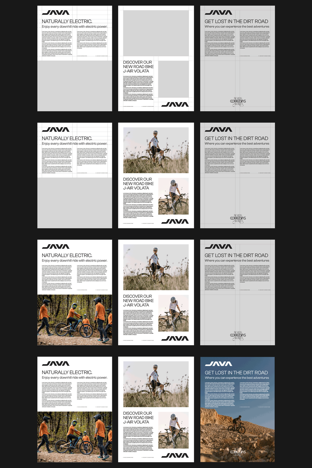
The layout was designed with a schematic approach aimed at favouring readability and ensuring immediate brand identification. In addition, it was designed to give ample space to photos, an element of primary importance in JAVA’s communication.
CATALOGUE
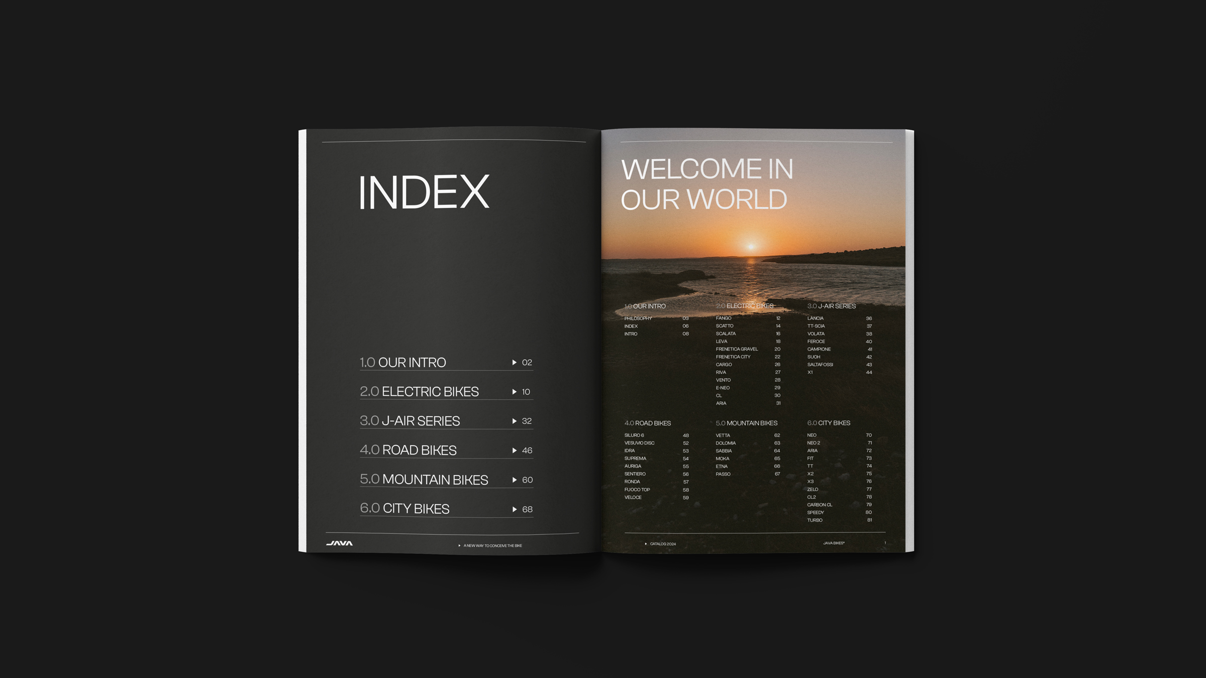
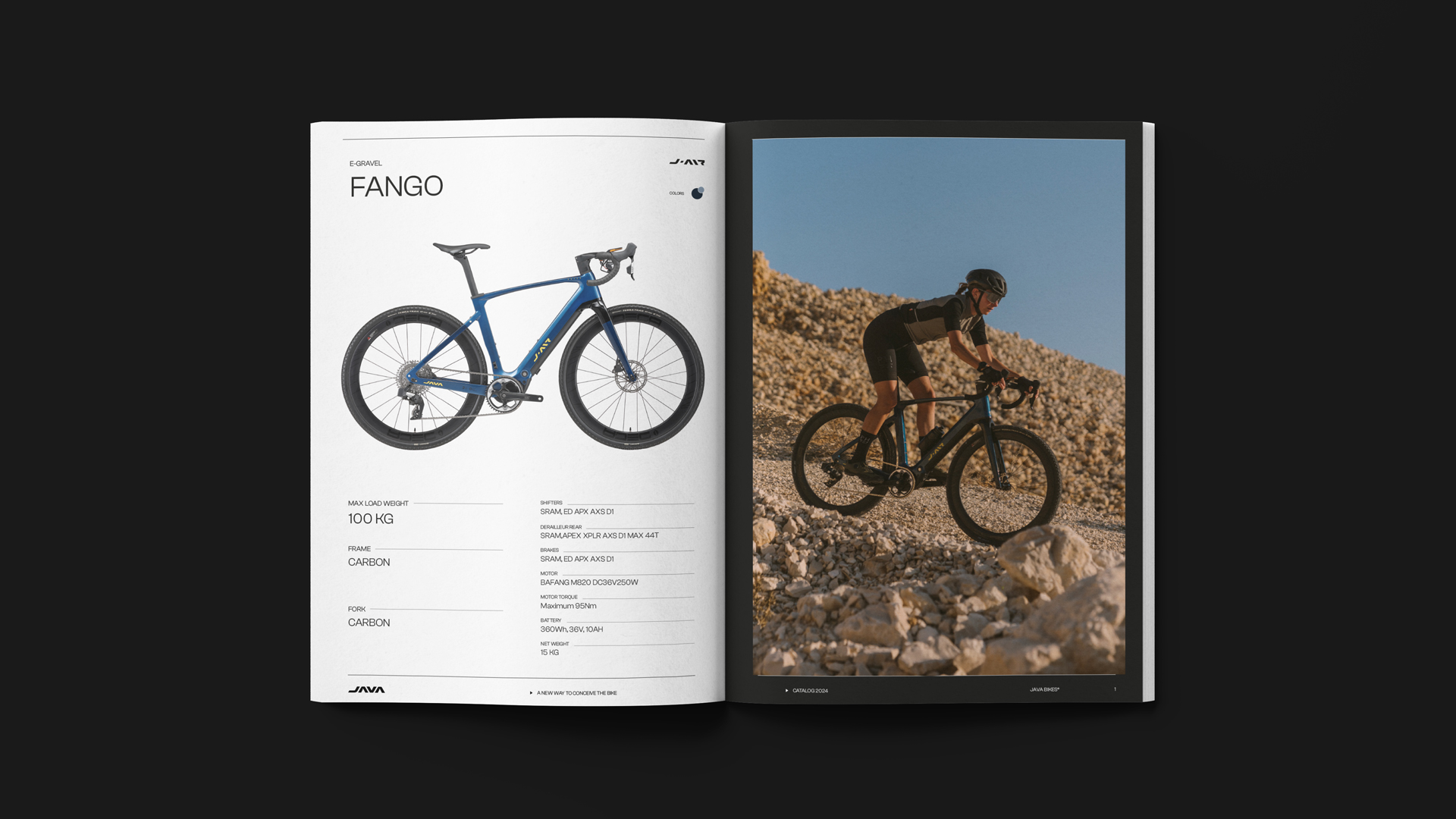
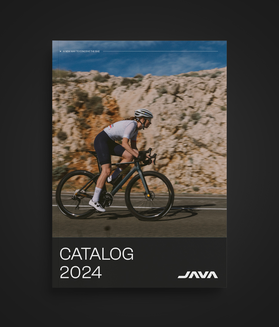
These same principles have been extended to the catalogue, another crucial element for the brand. Here too, the focus on cleanliness, precision and clarity is predominant, ensuring consistency with the previous study and leading the reader into the world of JAVA. The expression ‘Welcome in our world’ is placed at the beginning of the catalogue, in the table of contents, as the reader is about to immerse himself in their reality. Product images occupy ample space within the catalogue, with a variety ranging from still life to action photos, offering maximum visibility to the range of products on offer.
BRAND IDENTITY
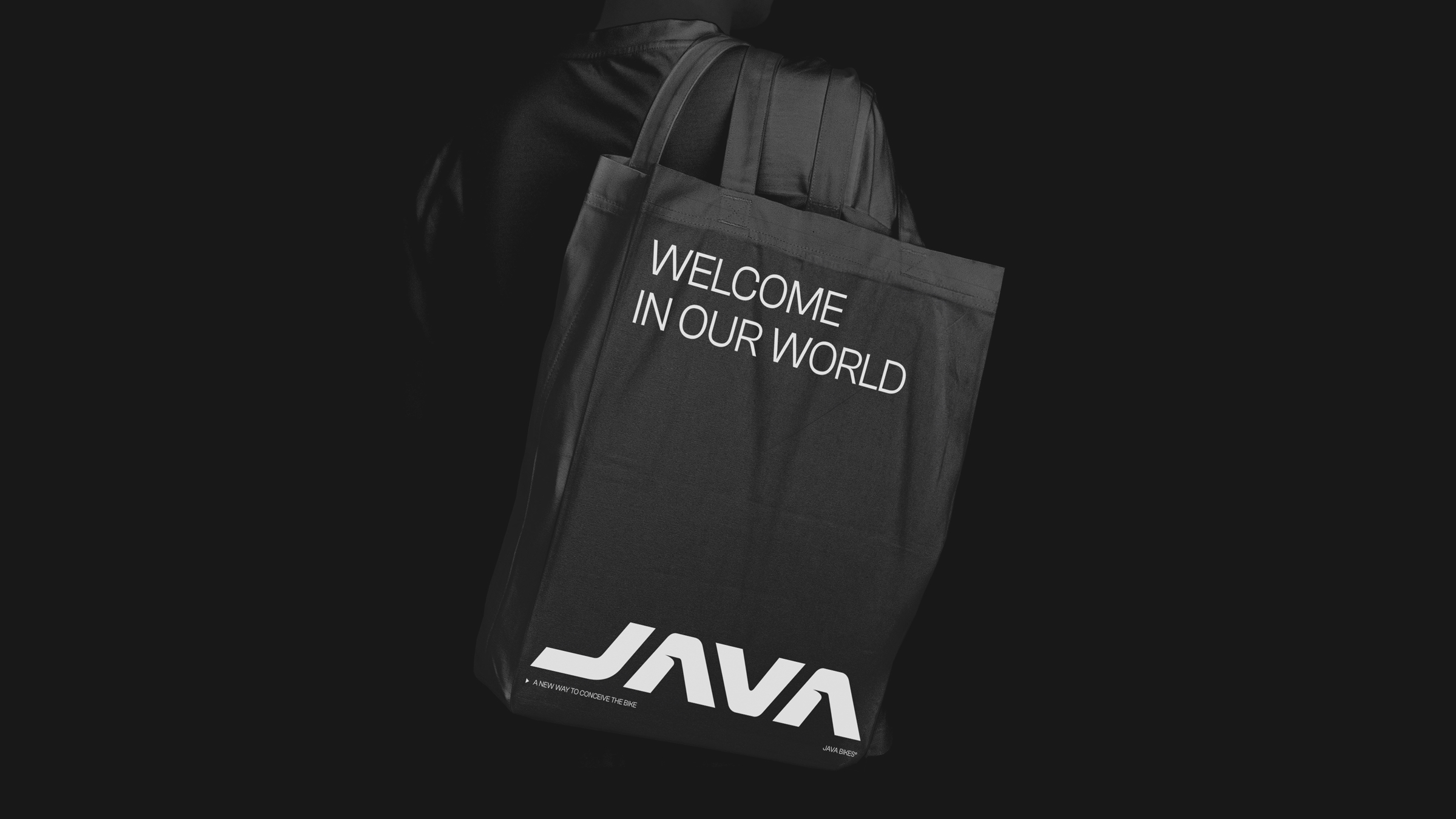
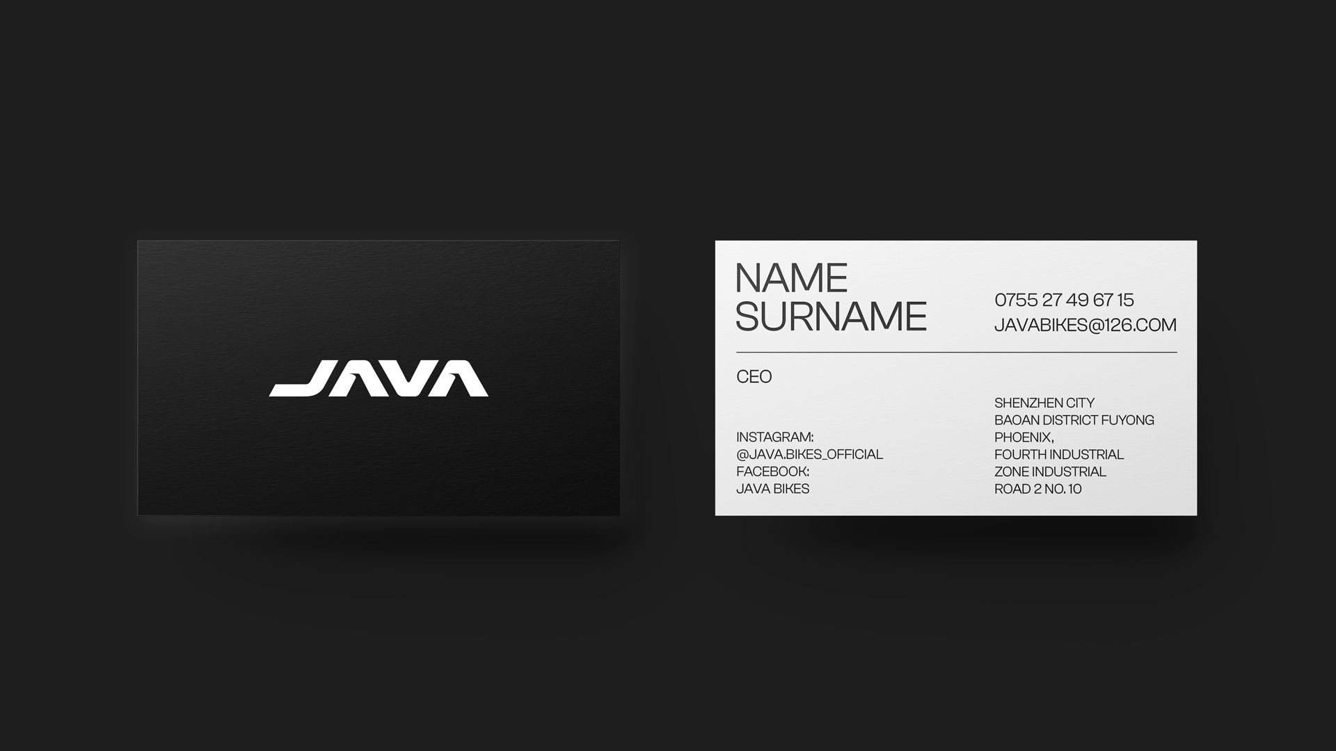
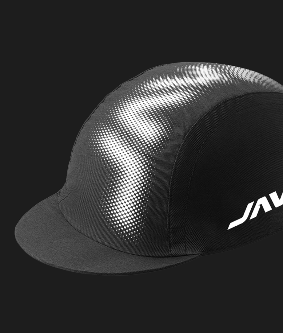
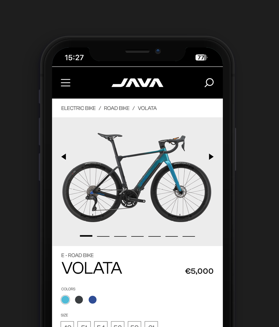
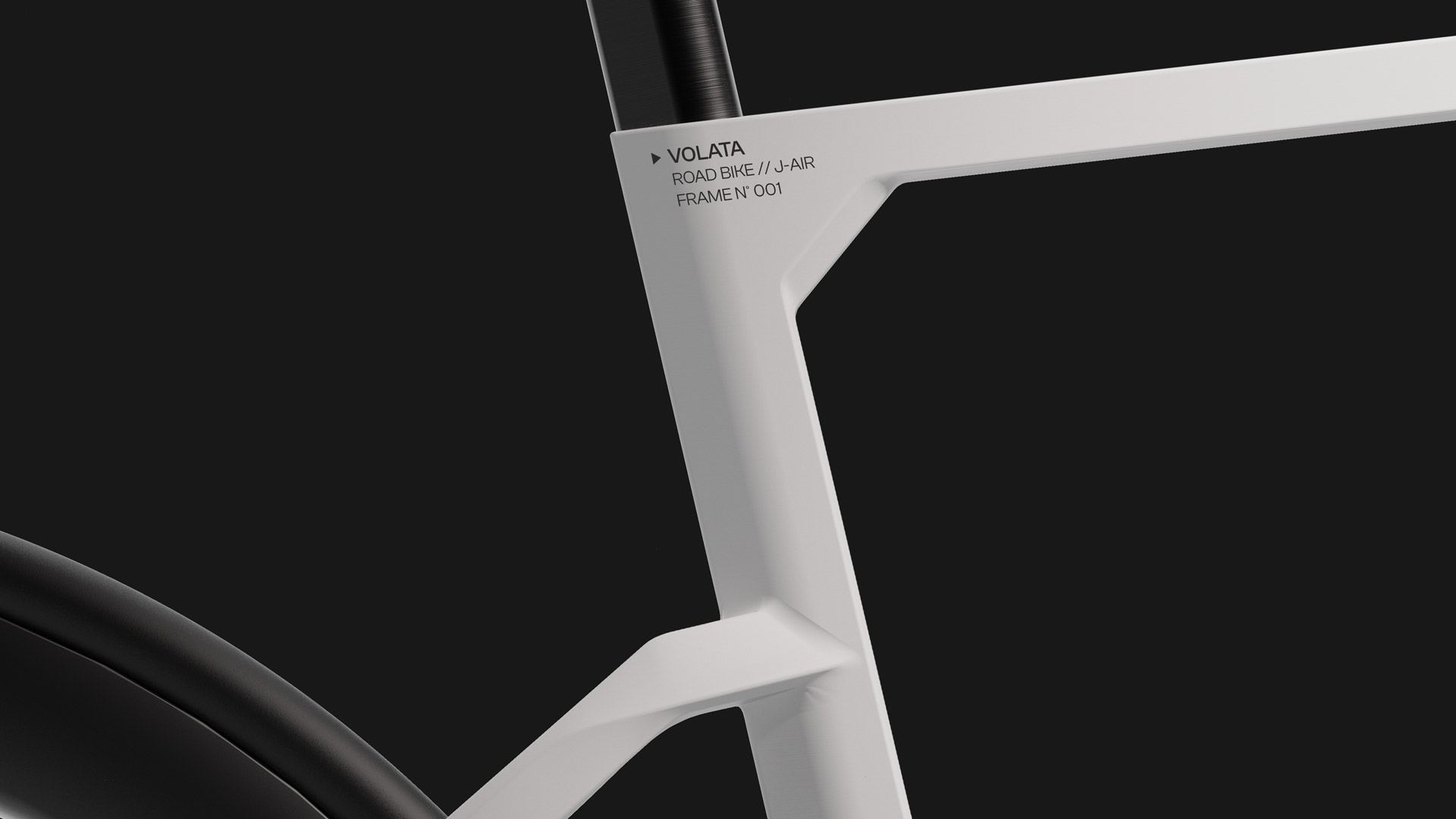
For the brand identity, we have adopted the same principle of minimalism and precision, which is reflected in the positioning and size of the logo, the choice of font, and above all the colours. Black and white predominate, lending an essential elegance to the brand.
CONCEPT STORE
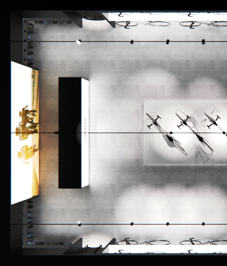
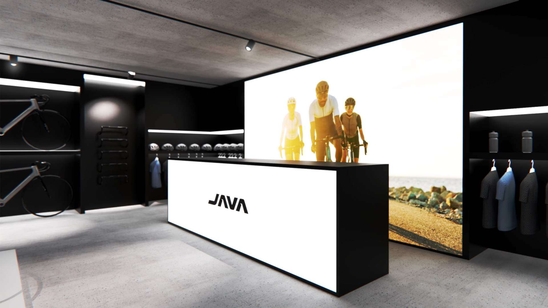
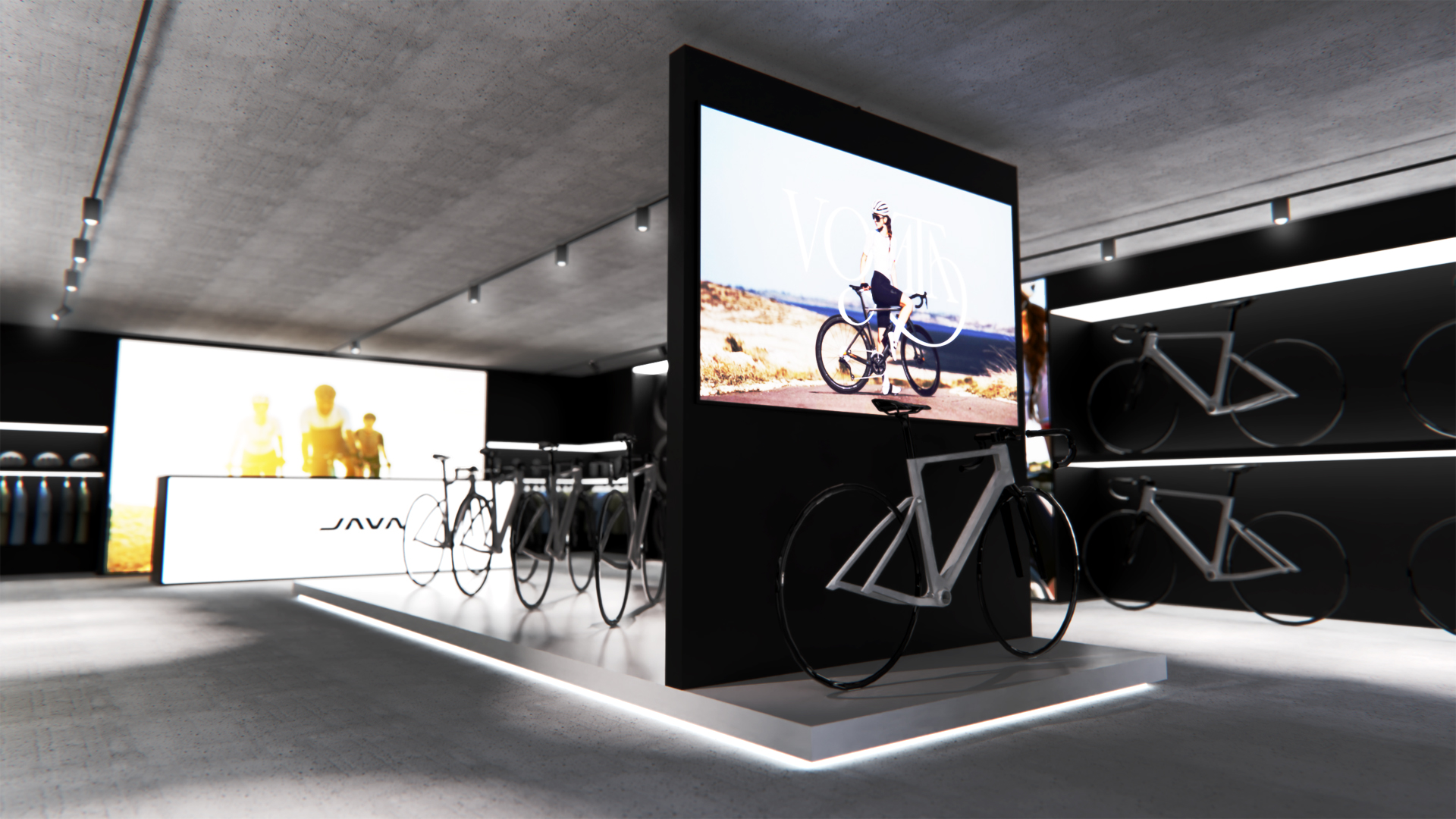
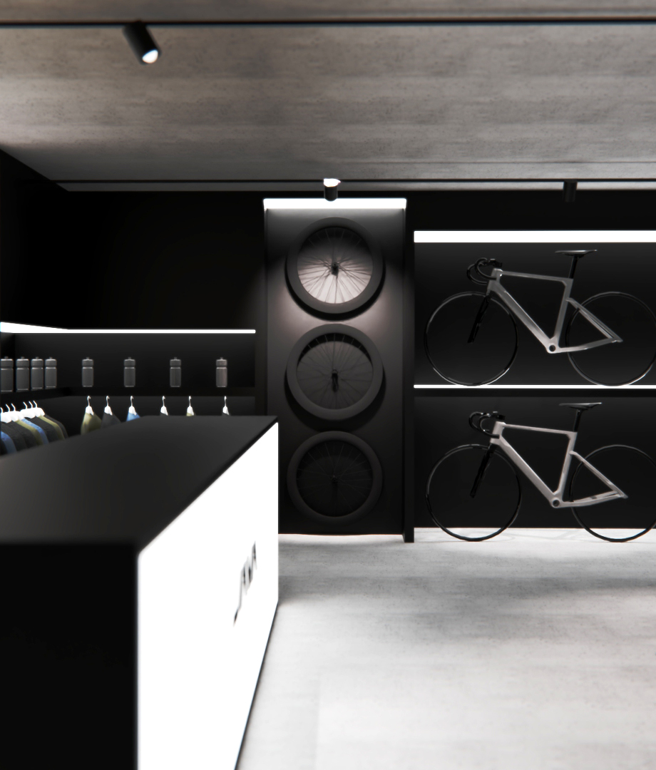
We have developed a shop concept that reflects the opening of numerous shops around the world, providing them with a distinctive stylistic coherence. We took a modern approach, experimenting with colours, materials, lighting and LED panels.
We chose to combine concrete with black and back lighting to create an atmosphere that combines modernity and robustness, while maintaining a high attention to detail. The main focus is always on the most important bicycle, while the other bicycles in the collection are displayed on the sides, ensuring an immediate perception of the range on offer.
We chose to combine concrete with black and back lighting to create an atmosphere that combines modernity and robustness, while maintaining a high attention to detail. The main focus is always on the most important bicycle, while the other bicycles in the collection are displayed on the sides, ensuring an immediate perception of the range on offer.
EXHIBITION DESIGN
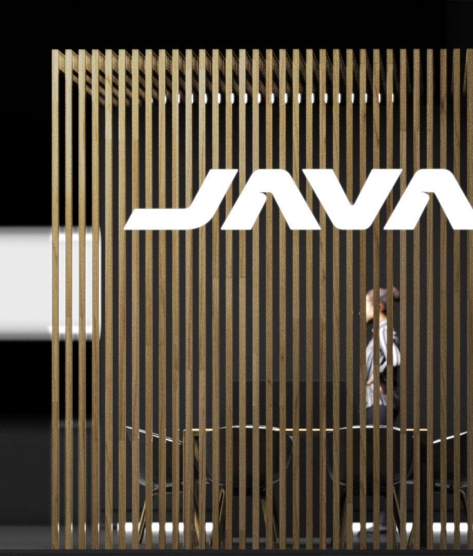
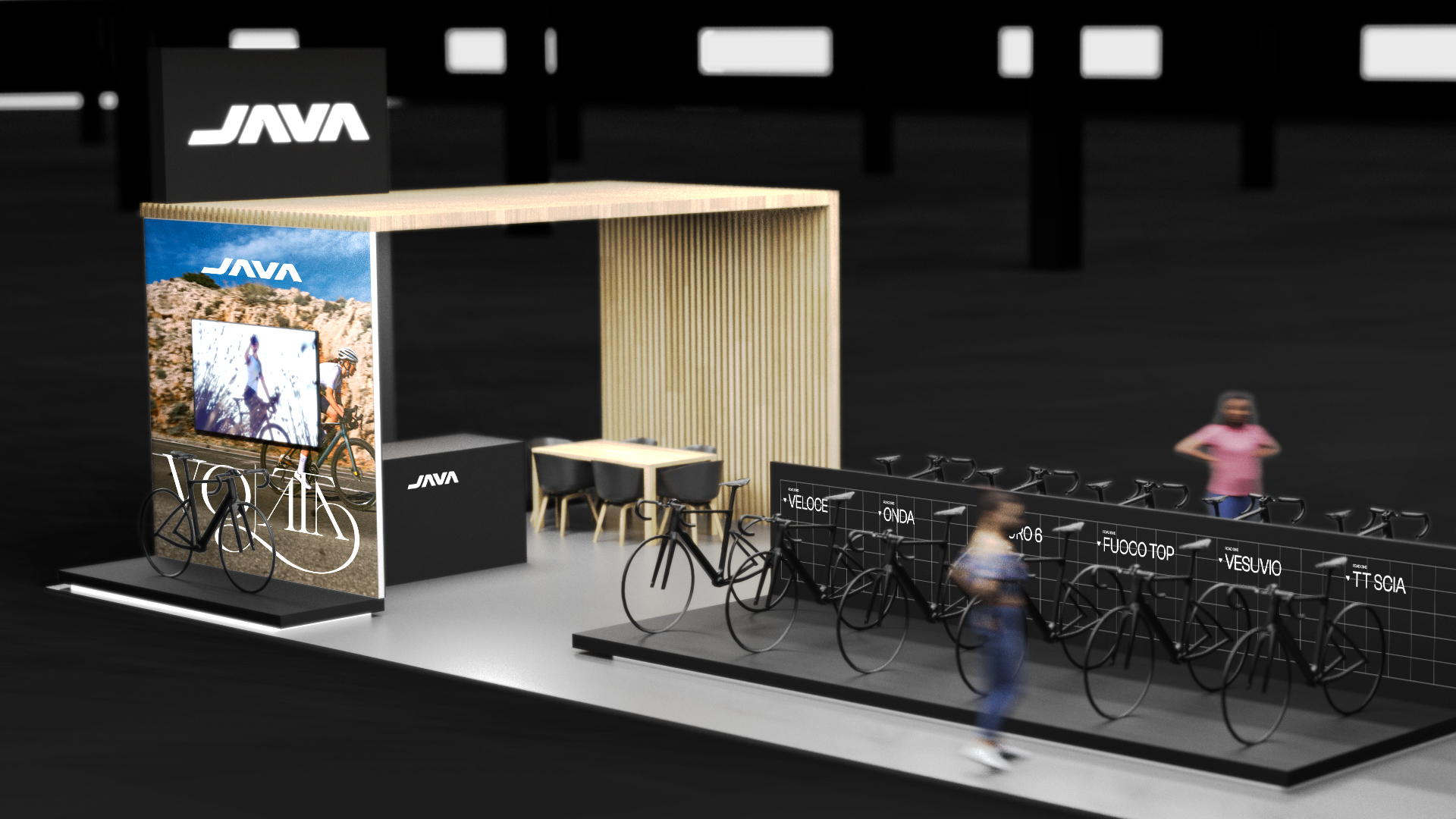
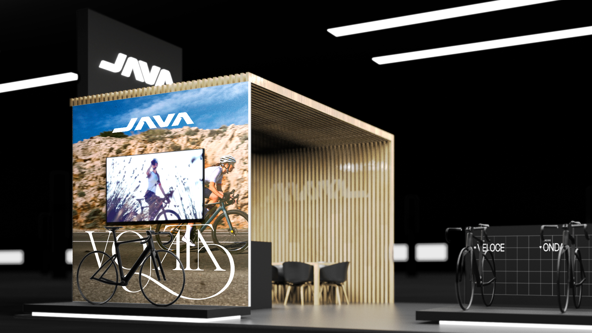
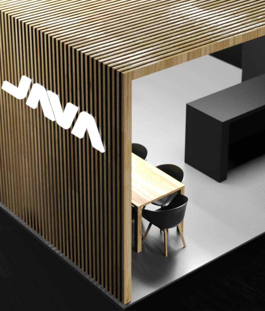
JAVA also has a strong presence at trade fairs, where it is essential to be immediately recognisable. Therefore, we have extended the same style adopted for concept stores to trade fair stands as well.
